


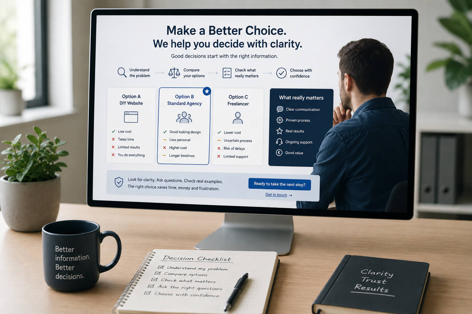
Most websites try to say:
Choose us.
A better website does something stronger.
It teaches the customer how to choose.
That sounds less aggressive, but it builds more trust.
If a visitor understands what matters, they can judge the options. If your business is the right fit, that judgement brings them closer to you.
The customer is already comparing
Visitors rarely look at one website only.
They compare.
Even if they do it quickly, they are checking:
- does this business understand my problem?
- is the service clear?
- what could go wrong?
- what should I ask before buying?
- does this look safe?
- is this worth contacting?
Your website should help with that comparison.
Not fear it.
A clear website gives buying criteria
A good website explains what the customer should look for.
For example, a website upgrade page can explain that a weak site may need:
- clearer service pages
- better mobile layout
- trust proof
- FAQ answers
- enquiry path
- SEO basics
- room to grow
Now the reader has a better lens.
They are no longer judging only by colour, price or style.
Useful page: Website Upgrade Ireland
Teaching builds trust
When you explain how to choose, you show confidence.
You are not hiding the decision process.
You are saying:
Here is what matters. Check it properly.
That gives a strong signal.
A business that can explain the buying decision usually understands the work.
Do not pretend every customer is ready
Some visitors are ready to enquire.
Others are still trying to understand the problem.
A useful website should serve both.
Ready visitor
They need a clear contact path.
Undecided visitor
They need a better way to think.
This is where articles, FAQs, service pages and case studies matter.
They help the reader become sharper.
Useful page: Website Build FAQ Ireland
Show what a poor choice looks like
This is often more useful than praising your own work.
Explain the warning signs.
Example
A weak small business website may have:
- vague service wording
- hidden contact details
- no proof
- poor mobile layout
- no useful FAQs
- no clear next step
- no service page structure
This helps the reader inspect their own site.
It also helps them inspect your competitors.
That is fine.
If your work is stronger, comparison helps you.
Case studies teach without lecturing
A case study is not only proof.
It teaches the reader what changed and why.
Better than saying:
We build professional websites.
Say:
The old homepage was too general. We separated services, added FAQs, improved the mobile flow and made the enquiry path easier to follow.
Now the reader understands what good work looks like.
Useful page: Websites for Local Service Businesses in Ireland
The website should reduce bad enquiries too
Teaching the customer how to choose also filters people.
That is useful.
A good website should help the wrong customer realise:
This is not for me.
That saves time.
The goal is not more enquiries at any cost.
The goal is better enquiries from people who understand what they need.
Give the reader a decision path
A useful page should quietly guide the visitor through a decision.
Simple path
- Here is the problem
- Here is why it matters
- Here is what good work should include
- Here is what can go wrong
- Here is how we approach it
- Here is the next step
This is better than filling the page with claims.
It makes the reader more ready.
Good content changes the reader
The strongest website content does not just inform.
It changes how the reader sees the problem.
Before reading, they may think:
I need a nicer website.
After reading, they may realise:
I need clearer service pages, better mobile structure and a proper enquiry path.
That shift matters.
The visitor has not been pushed.
They have become more capable of choosing.
The simple test
Read your website and ask:
- does it help the visitor judge options?
- does it explain what matters?
- does it show warning signs?
- does it prove how you work?
- does it answer doubts before enquiry?
- does it help the wrong customer leave early?
- does it make the next step clear?
If the page only says “we are good”, it is weak.
If it helps the reader understand what good means, it is stronger.
Teach first. Sell second.
A website should not beg for trust.
It should earn trust by making the customer smarter.
Show what matters.
Explain the risk.
Give proof.
Make the next step simple.
The visitor should leave the page thinking:
I understand this better now.
That is often the moment before they enquire.
Need a website that helps customers choose?
Site Launch builds and improves small business websites with clear service pages, useful FAQs, proof and simple enquiry paths.