


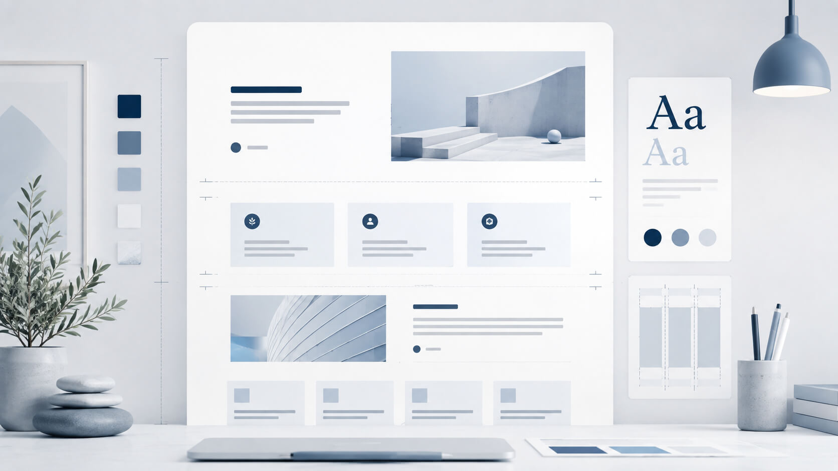
White space is not wasted space.
It is the pause between ideas.
A crowded website feels like someone talking without stopping. The reader gets tired before the message lands.
Good spacing gives the page rhythm. It helps visitors understand what matters, where one idea ends and what they should do next.
Spacing works like speech
In normal conversation, pauses matter.
A short pause separates one thought from the next.
A longer pause gives weight to something important.
A website works the same way.
If every block is pushed together, the page feels rushed. The visitor has no time to understand the offer, trust the business or notice the next step.
Example: no spacing
Your website should explain what your business does, who the service is for, why the visitor can trust you and what they should do next. If all this information is placed too close together, the page becomes tiring. The reader has no pause between ideas, so even useful text starts to feel heavy.
Example: better spacing
Your website should explain what your business does.
It should show who the service is for.
It should give the visitor a reason to trust you.
It should make the next step clear.
Spacing gives each idea time to land.
White space separates meaning
Spacing helps the visitor see:
- what belongs together
- what is a new thought
- what is important
- where to pause
- where to act
Without spacing, the page becomes a wall.
With spacing, it becomes a route.
Typography matters too
Fonts are not just style.
A font controls how the message feels.
A poor font can make a clear page feel cheap, nervous or hard to trust.
A good font should be easy to read and quiet enough to carry the message.
The reader should not think about the font first. They should simply find the page easy to read.
Good typography needs control
A website needs:
- readable font size
- clear heading weight
- enough line height
- good contrast
- consistent spacing
- no decorative fonts for serious content
Typography and spacing work together.
The font gives the message a voice.
The spacing gives it pace.
Mobile makes spacing more important
On a phone, weak spacing becomes obvious.
Long blocks feel longer.
Small text feels smaller.
Buttons feel harder to tap.
Crowded pages feel tiring faster.
A good mobile layout needs short sections, clear margins and enough distance between actions.
Useful page: https://sitelaunch.ie/new-website-build-ireland
White space builds trust
A clear page feels controlled.
A crowded page feels anxious.
That matters.
Visitors often judge a business before they read much. Clean spacing gives the signal that the business is organised, calm and easier to deal with.
This is not decoration.
It is trust.
White space is not minimalism
White space does not mean an empty website.
The page still needs useful content:
- clear service explanation
- proof
- FAQs
- contact path
- next step
The point is not to say less.
The point is to stop forcing everything into one dense block.
Useful page: https://sitelaunch.ie/website-upgrade-ireland
Simple test
Look at your website and ask:
- does the page feel rushed?
- are the sections too close together?
- is the text easy to read on mobile?
- does the CTA have enough space around it?
- do headings clearly separate ideas?
- does the font feel calm and readable?
If the page feels like someone talking too fast, it needs better spacing.
The point
White space is part of the message.
It helps the visitor read, pause, understand and act.
A website with good spacing does not feel empty.
It feels clear.
Need a clearer website layout?
Site Launch builds and improves websites for small Irish businesses with clear spacing, readable typography, mobile-friendly structure and simple enquiry paths.
Useful pages: