


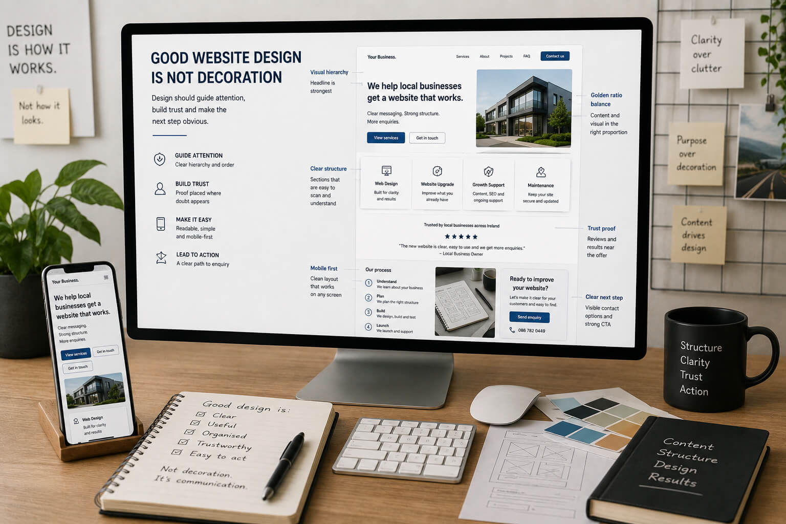
A business website does not need design for decoration.
It needs design to control attention.
The visitor should know where to look, what matters, what to trust and what to do next.
If a website looks stylish but the customer still does not understand the service, the design has failed.
Good design does not add meaning.
It puts meaning in the right place.
Design should make the page easier to read
A website is not a poster.
It is not a newspaper column either.
People do not read websites from top to bottom like a printed article.
They scan.
They stop.
They compare.
They look for proof.
They check the next step.
Design should support that behaviour.
A good website uses:
- clear headings
- short sections
- strong spacing
- readable text
- useful visual breaks
- clear buttons
- service cards
- FAQ blocks
- proof sections
- contact paths
This makes the page easier to understand without forcing the visitor to read everything.
Design has rules before taste begins
Some parts of design are not just personal taste.
Before style, the page must work.
Basic design standards
A business website should have:
- readable text
- clear contrast
- enough spacing
- visible call-to-action buttons
- strong mobile layout
- logical page order
- clear service sections
- consistent visual rhythm
- images that support the message
- no background that fights the text
If these basics are missing, it is not “minimal”. It is unfinished.
If you are a designer, show the design
A designer should not need to explain everything with promises.
The work should be visible.
A potential customer should be able to see:
- finished projects
- mobile versions
- before and after examples
- service page structure
- real website sections
- how text is organised
- how the enquiry path works
Phrases like “modern design”, “clean interface” and “unique style” are weak on their own.
Finished projects carry more weight.
Useful page: Website Design and Rebuild Services
The golden ratio is about balance, not magic
The golden ratio is often treated like a design trick.
It is better to think of it as a reminder about proportion.
A page should not make everything the same size, same weight and same importance.
The visitor needs visual order.
Good proportions mean:
- the headline is stronger than the paragraph
- the main section leads the page
- the visual supports the message
- the button does not disappear
- cards have space around them
- important content is not buried
- secondary details stay secondary
In practice, this may mean a 60/40 or 65/35 layout instead of two equal halves fighting each other.
One part leads.
The other supports.
That is useful design.
Design becomes too much when it competes with the message
Design is not always helpful.
Sometimes it gets in the way.
Design is too much when:
- animation distracts from the button
- background effects make text harder to read
- icons add no meaning
- images are used only to fill space
- cards repeat the same point
- gradients make the page heavier
- visual effects slow the site down
- the visitor remembers the effect but not the offer
A website should not show off the designer.
It should make the business easier to understand.
A website should not look like a newspaper column
Text matters.
But a website cannot be built as one long column of text.
A visitor needs a route through the page.
A better page structure
Instead of one heavy text block, use:
- one clear heading
- one short explanation
- one proof section
- one process section
- one FAQ block
- one contact step
This is not just design.
It is structure.
The design turns the content into a path.
Design should support trust
Trust does not come from polish alone.
A beautiful page with no proof still feels weak.
Trust needs visible evidence.
Good design places proof where doubt appears
This can include:
- reviews near the enquiry section
- case studies near service claims
- real photos beside process details
- FAQs before the final CTA
- clear contact details near action points
Trust proof should not be hidden at the bottom of the page.
It should appear where the visitor needs reassurance.
Useful page: Websites for Local Service Businesses in Ireland
Design should make mobile easier, not smaller
Mobile design is not desktop squeezed into a phone.
It needs its own structure.
Good mobile design needs:
- shorter sections
- clear spacing
- easy buttons
- readable text
- simple menus
- clean image cropping
- visible contact options
- no decorative clutter
If most visitors use mobile, then mobile layout is not a secondary version.
It is the main experience.
Design should lead to action
A website is not finished when it looks good.
It is finished when the visitor can understand the business and take the next step.
That step may be:
- call
- send enquiry
- request review
- ask for a quote
- send photos
- book a service
The design should make that step obvious.
If the visitor has to search for what to do next, the page is not working properly.
What Site Launch means by website design
At Site Launch, design starts after the structure is clear.
The work is not only about colours and images.
It includes:
- page order
- service sections
- visual hierarchy
- mobile layout
- copy structure
- trust placement
- FAQ placement
- enquiry path
- future page growth
The website should look designed.
But more importantly, it should feel organised for the customer.
Useful pages:
The simple test
Before approving a website design, ask:
- Is the main message clear?
- Is the service easy to understand?
- Does the layout guide attention?
- Is the button visible?
- Is the mobile version clean?
- Is there enough proof?
- Is anything decorative getting in the way?
- Does the page feel like a route, not a text wall?
If the design only looks good, it is not enough.
A business website must help people understand, trust and act.
Good design gives the content a proper shape
Design should not bury the message.
It should not decorate weak content.
It should take the real meaning of the page and make it easier to follow.
That is the job.
A good website does not just look better than a newspaper column.
It turns information into a clear path from first impression to enquiry.